Your cart is currently empty!

Discover the Power of WindAiza
WindAiza is a state-of-the-art wind resource analysis tool designed for researchers, academics, and renewable energy professionals. Explore its interactive plots, advanced analytics, and insights tailored for smarter energy decisions. Presented here are some of the plots which can be obtained using the WindAiza app just by the click of a button
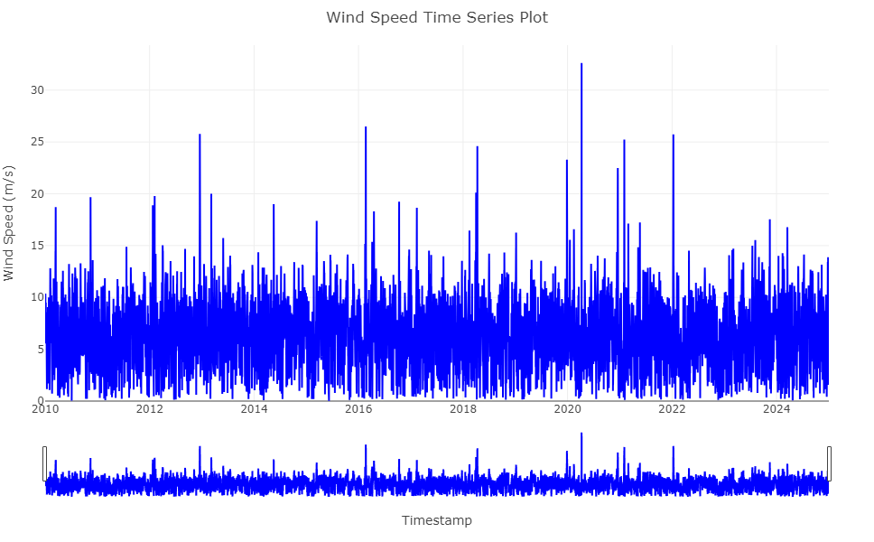
Comprehensive Wind Speed Time Series Analysis
This Wind Speed Time Series Plot provides a complete visualisation of wind speed variations over time, spanning multiple years. The plot showcases granular hourly data, offering insights into long-term wind patterns, seasonal trends, and anomalies.
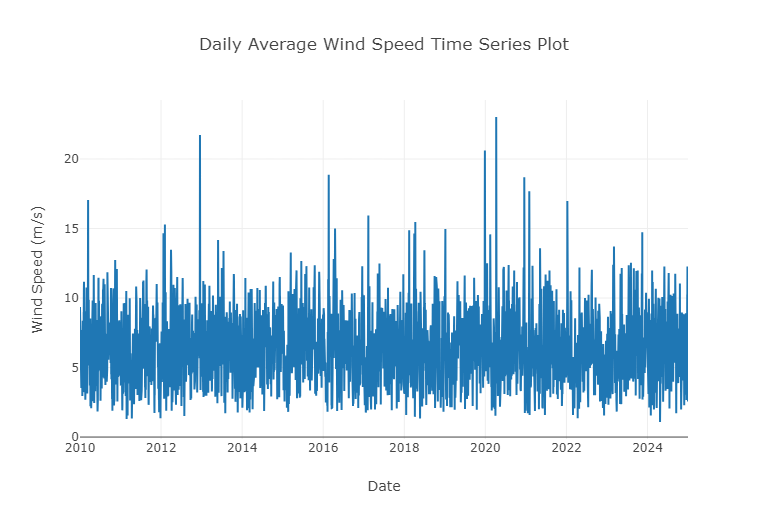
Daily Average Wind Speed Time Series Analysis
The Daily Average Wind Speed Time Series Plot delivers an aggregated view of wind speed patterns, showcasing daily averages over several years. This visualisation simplifies large datasets into meaningful insights, allowing users to identify stable and peak wind speed trends.
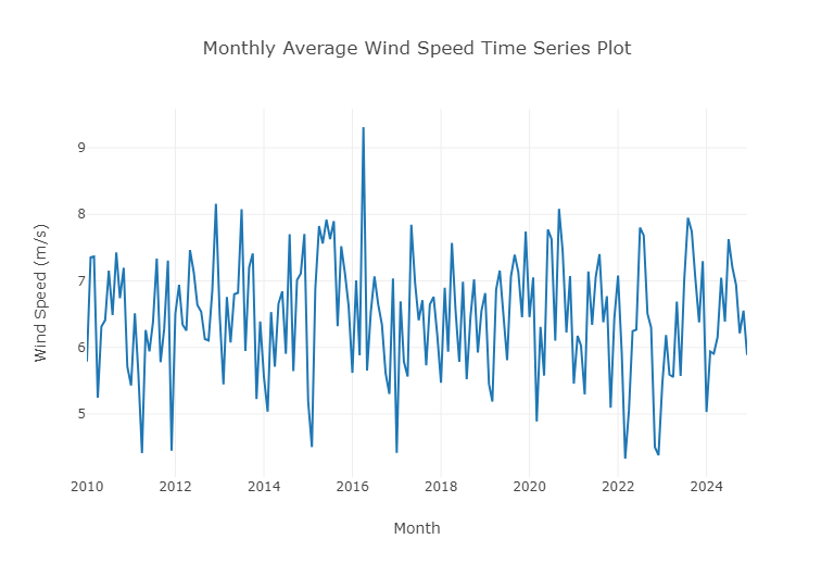
Monthly Average Wind Speed Time Series Analysis
The Monthly Average Wind Speed Time Series Plot provides a broader perspective on wind speed trends, capturing average wind speeds for each month across multiple years. This visualisation helps uncover long-term seasonal patterns and inter-annual variations, critical for strategic planning.
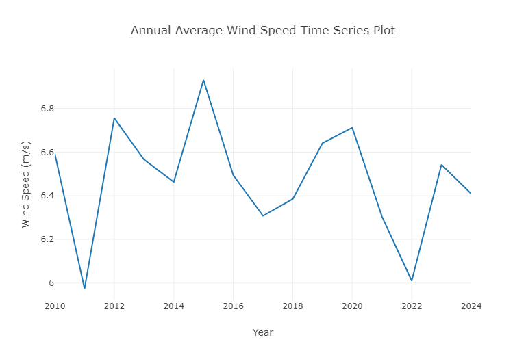
Annual Average Wind Speed Trend Analysis
The Annual Average Wind Speed Time Series Plot provides a high-level view of yearly wind speed fluctuations, helping identify long-term trends and variations in wind resource availability. This visualisation is essential for understanding the macro-level wind energy potential over time.
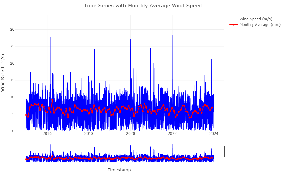
Combined Time Series with Monthly Average Wind Speed
This visualisation overlays raw wind speed data with its monthly average, providing a comprehensive view of wind speed variability and its smoothed long-term trends. The red line highlights monthly average wind speeds, offering a clear representation of consistent patterns amidst the fluctuations in the blue raw data.
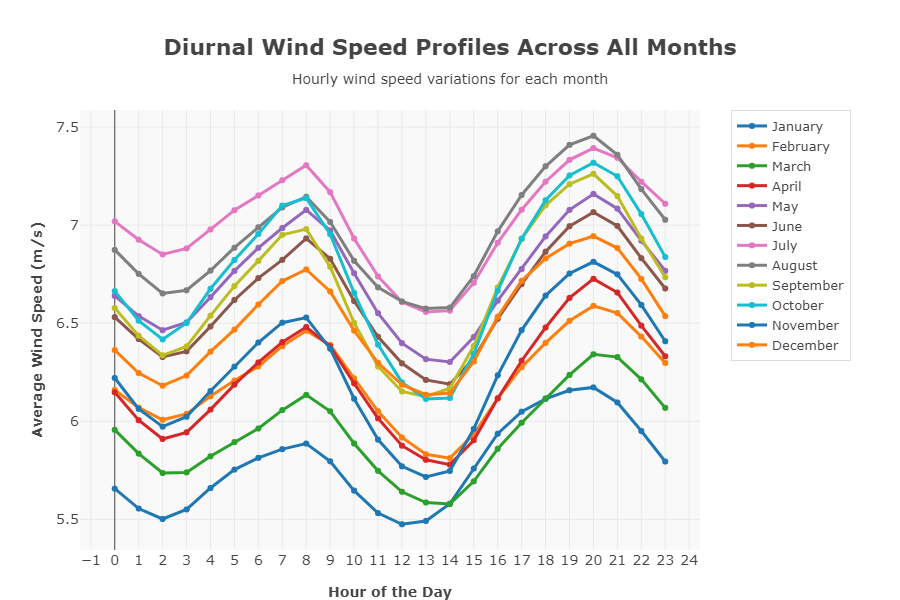
Diurnal Profiles of All Months
This plot illustrates the hourly variation of average wind speed for each month, revealing the diurnal patterns and wind dynamics throughout the year. Each line represents a specific month, highlighting how wind speed fluctuates during different times of the day across seasons.
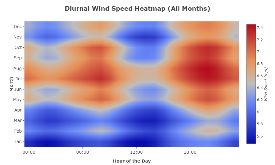
Diurnal Heat Map
This diurnal heatmap visualizes wind speed variations across different months and hours of the day. The color-coded intensity scale highlights stronger wind patterns during specific times, helping optimize wind farm operations and energy storage strategies.
Diurnal Wind Speed Trends Across Years
This plot illustrates hourly wind speed trends over multiple years, capturing long-term diurnal patterns. The dashed black line represents the average wind speed trend, helping analysts detect annual variations and consistency in wind behavior.

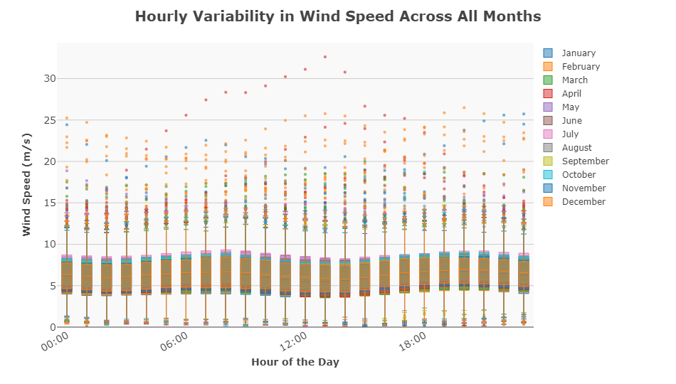
Hourly Variability in Wind Speed Across All Months
This box plot with scatter overlays visualizes hourly wind speed distributions across all months, highlighting seasonal variability and extreme wind events. The box structure represents the interquartile range (IQR), while outliers provide insights into rare, high-wind-speed occurrences.
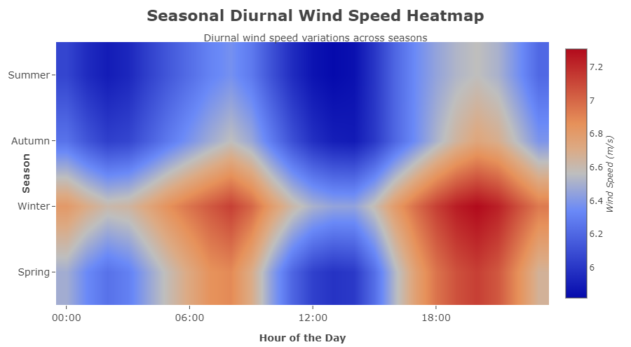
Seasonal Diurnal Wind Speed Heatmap
This seasonal heatmap visualizes diurnal wind speed variations across different seasons, providing insights into how wind patterns shift throughout the year. The color gradient highlights peak wind hours, making it an essential tool for seasonal energy optimization and wind farm efficiency planning.
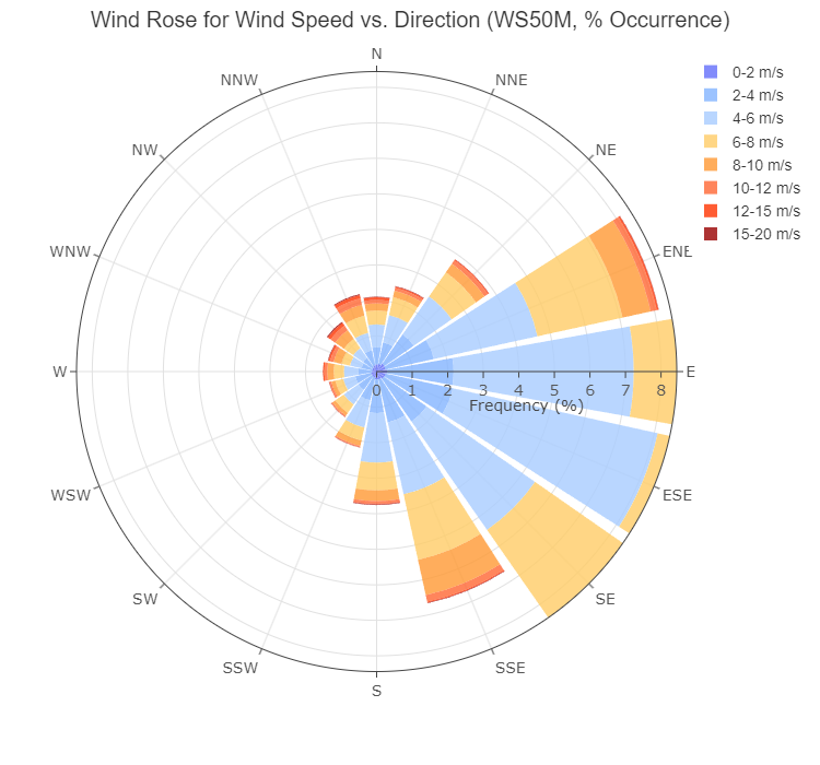
Wind Rose: Wind Speed vs. Direction
This wind rose diagram visualizes the frequency distribution of wind speeds across different directions, helping assess dominant wind flows for optimal turbine placement and wind farm design. The color-coded bands represent various wind speed ranges, providing a clear breakdown of wind patterns
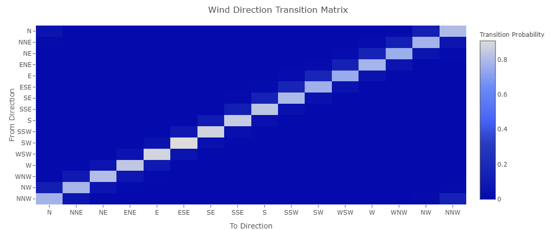
Wind Direction Transition Matrix
This transition matrix visualizes the probability of wind shifting from one direction to another, providing crucial insights into wind persistence and variability. The lighter shades indicate higher transition probabilities, helping predict wind flow patterns for turbine yaw control and wind farm efficiency optimization.
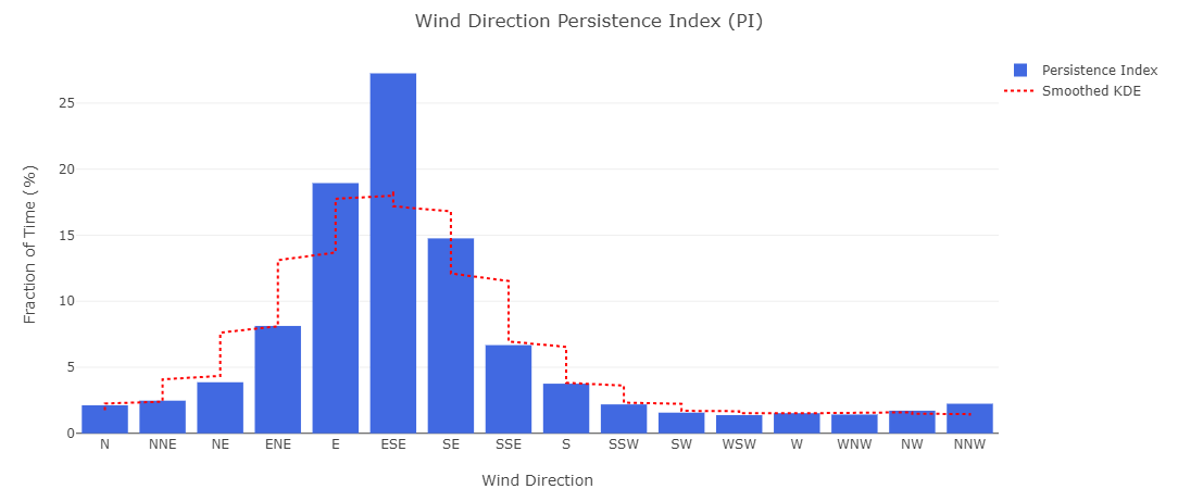
Wind Direction Persistence Index (PI)
This Wind Direction Persistence Index (PI) plot illustrates how frequently the wind remains in specific directions over time. The blue bars represent the persistence index, while the red dashed line (Smoothed KDE) provides a probabilistic estimate of wind direction stability.
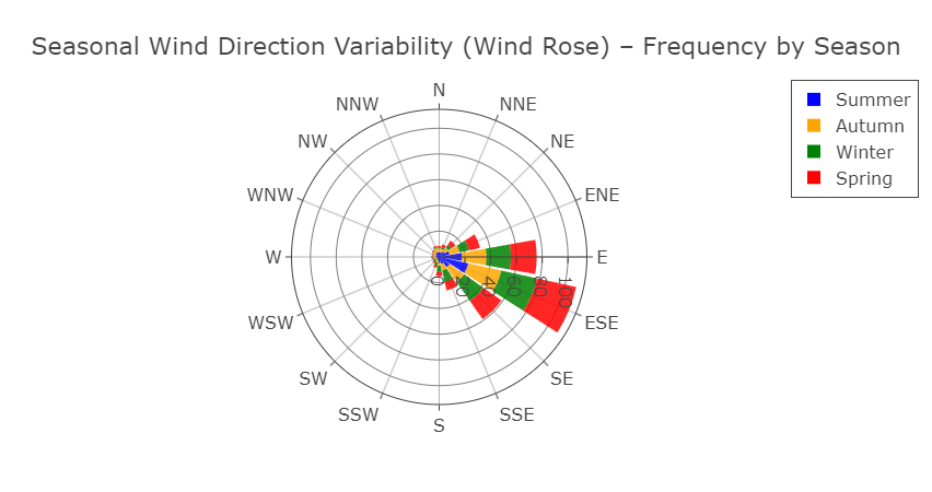
Seasonal Wind Direction Variability (Wind Rose)
This seasonal wind rose diagram illustrates how wind direction frequencies vary across different seasons. Each color represents a specific season, allowing for easy comparison of dominant wind flows throughout the year.
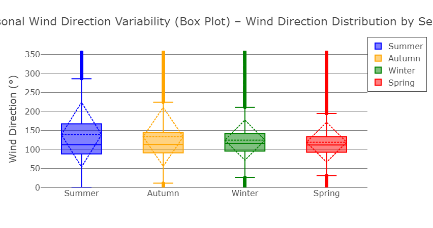
Seasonal Wind Direction Variability (Box Plot).
This box plot represents the distribution of wind direction across different seasons, providing insights into seasonal wind variability and dominant wind trends. The box structure shows the interquartile range (IQR), while whiskers and outliers highlight directional extremes.
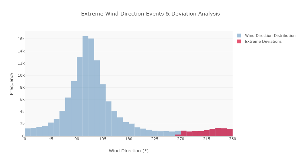
Extreme Wind Direction Events & Deviation Analysis
This histogram illustrates the distribution of wind direction frequencies, with highlighted extreme deviations (red) representing rare, high-variance wind events. Understanding these deviations is crucial for turbine stability, yaw control, and structural resilience.
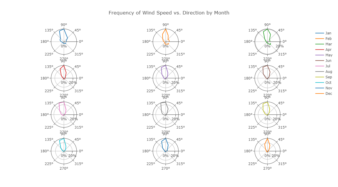
Monthly Wind Speed vs. Direction Frequency
This multi-panel wind rose diagram displays the monthly distribution of wind speed and direction, allowing for detailed seasonal trend analysis. Each subplot represents a different month, showing dominant wind directions and their frequency.
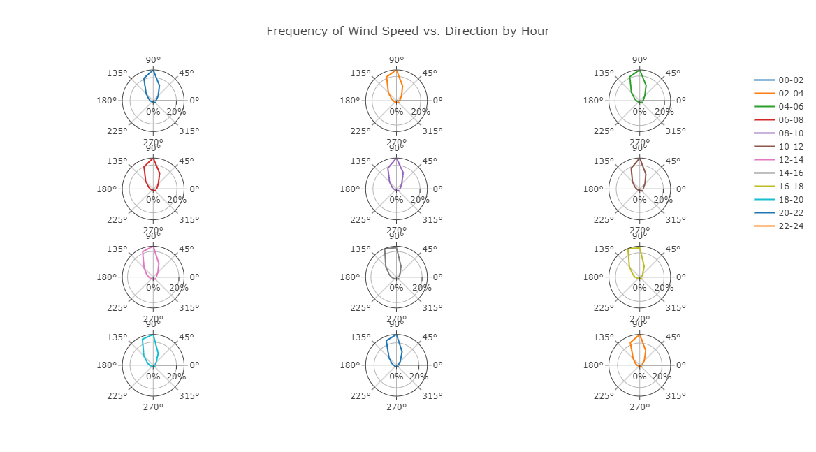
Hourly Wind Speed vs. Direction Frequency
This multi-panel wind rose visualization presents wind speed frequency and direction across different hours of the day. Each subplot represents a specific two-hour interval, highlighting how wind direction shifts throughout the 24-hour cycle.
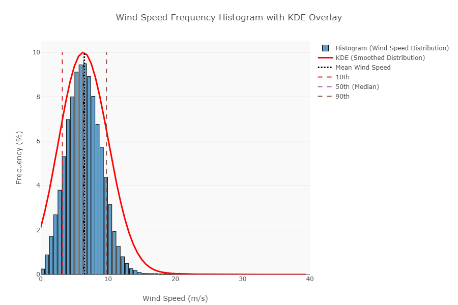
Wind Speed Frequency Histogram with KDE Overlay
This histogram illustrates the distribution of wind speeds, with a Kernel Density Estimate (KDE) overlay providing a smoothed representation of wind behavior. The dashed vertical lines highlight key percentiles (10th, 50th (median), and 90th) for statistical insights.
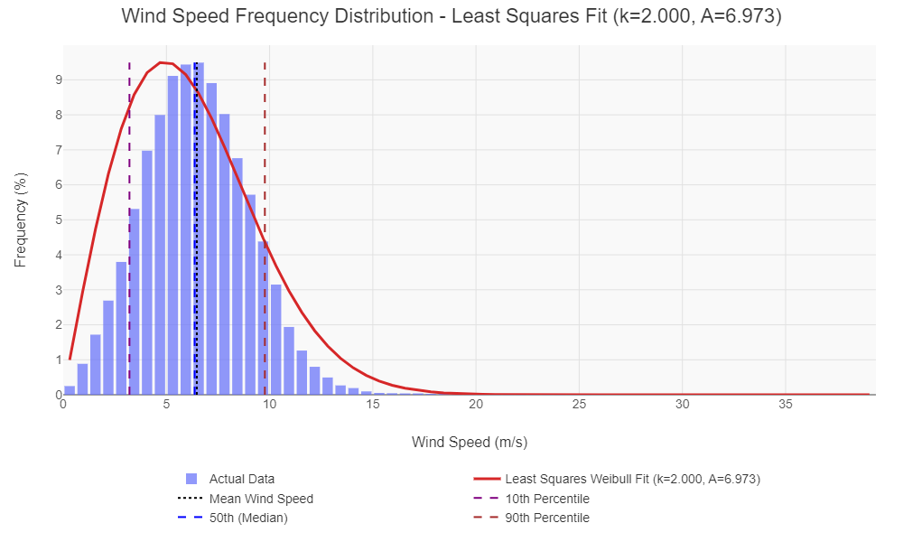
Wind Speed Frequency Distribution – Least Squares Fit
This histogram showcases the wind speed frequency distribution, with a Least Squares Weibull Fit (red curve) applied for accurate wind speed modeling. The dashed lines indicate key percentiles (10th, 50th (median), and 90th) to provide insights into wind speed variability.
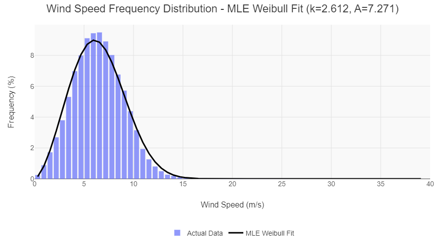
Wind Speed Frequency Distribution – MLE Weibull Fit
This histogram represents the wind speed distribution, with a Maximum Likelihood Estimation (MLE) Weibull Fit (black curve) providing a statistically optimized model. The shape (k) and scale (A) parameters define the wind speed probability density, essential for energy yield estimation.
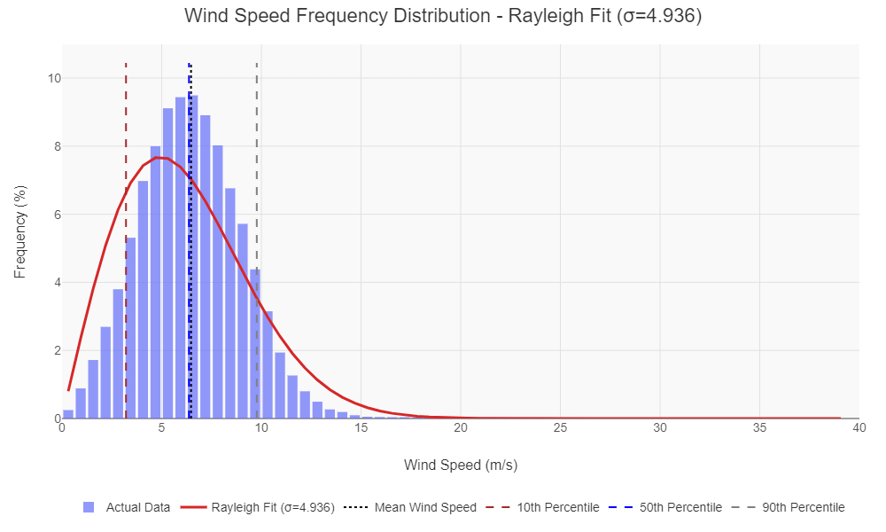
Wind Speed Frequency Distribution – Rayleigh Fit
This histogram displays the wind speed frequency distribution, overlaid with a Rayleigh probability density function (red curve). The dashed vertical lines mark key wind speed percentiles (10th, 50th (median), and 90th), providing insights into wind variability.
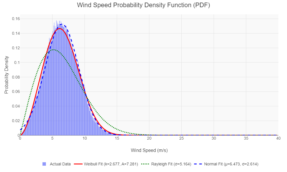
Wind Speed Probability Density Function (PDF)
This probability density function (PDF) plot compares different statistical distributions fitted to actual wind speed data. The Weibull (red), Rayleigh (green), and Normal (blue dashed) fits provide insights into wind speed variability and energy potential.
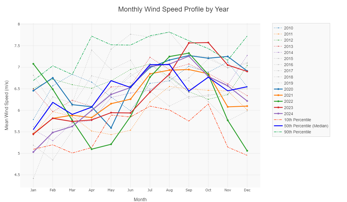
Monthly Wind Speed Profile by Year
This multi-year comparison plot visualizes monthly wind speed trends across different years. The solid and dashed lines represent wind speed variability, with percentile markers (10th, 50th, 90th) providing statistical insights into seasonal wind behavior.
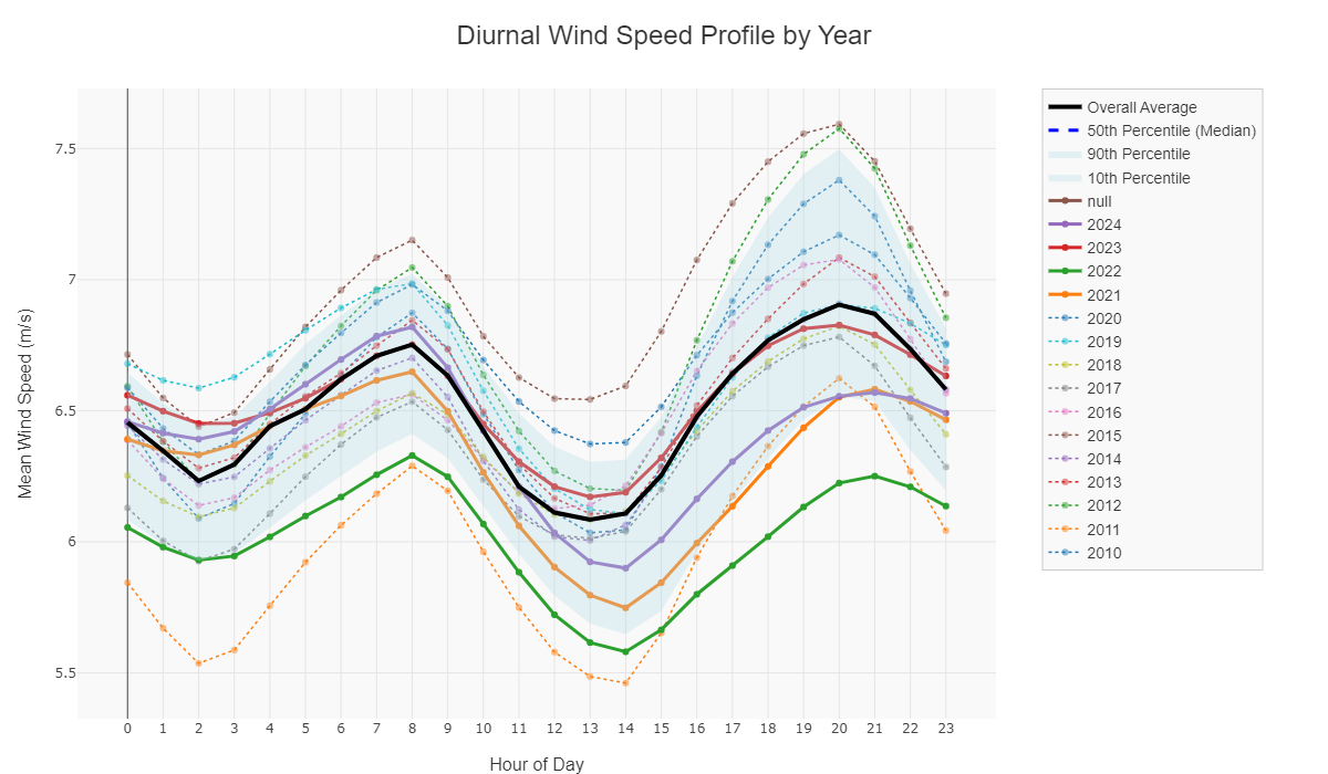
Diurnal Wind Speed Profile by Year
This diurnal wind speed analysis visualizes hourly wind speed variations across multiple years, highlighting key trends in daily wind behavior. The solid black line represents the overall average, while percentile bands (10th, 50th, and 90th) show statistical variability.
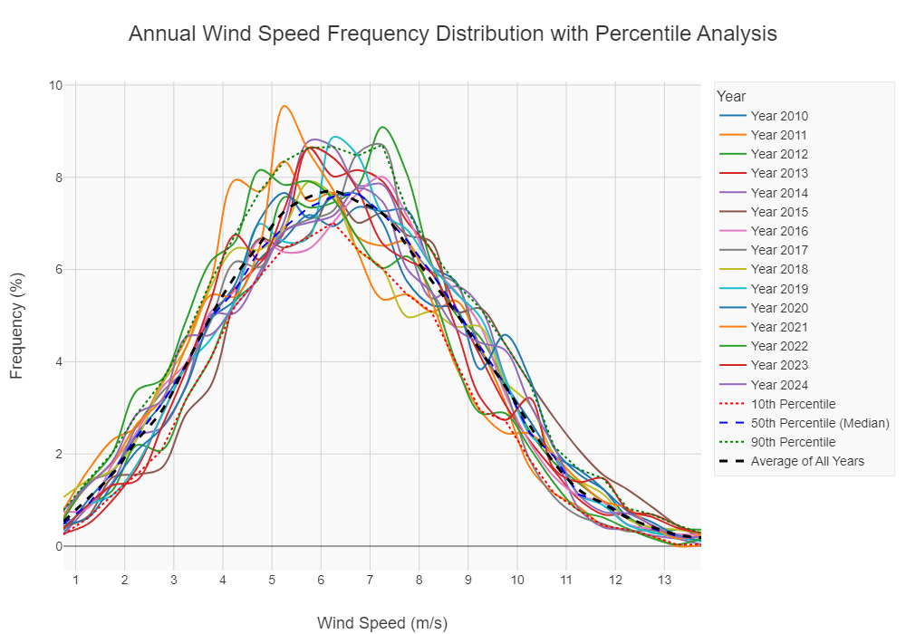
Annual Wind Speed Frequency Distribution with Percentile Analysis
This multi-year wind speed frequency distribution compares annual variations in wind behavior. The percentile markers (10th, 50th (median), and 90th) provide insights into wind speed consistency, while the black dashed line represents the average of all years for benchmarking.
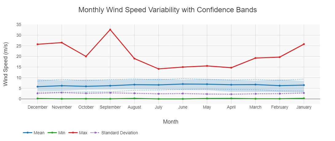
Monthly Wind Speed Variability with Confidence Bands
This plot illustrates monthly wind speed variability, displaying key statistical measures: mean wind speed (blue), minimum (green), maximum (red), and standard deviation (purple dashed line). The confidence band around the mean provides insight into wind speed fluctuations
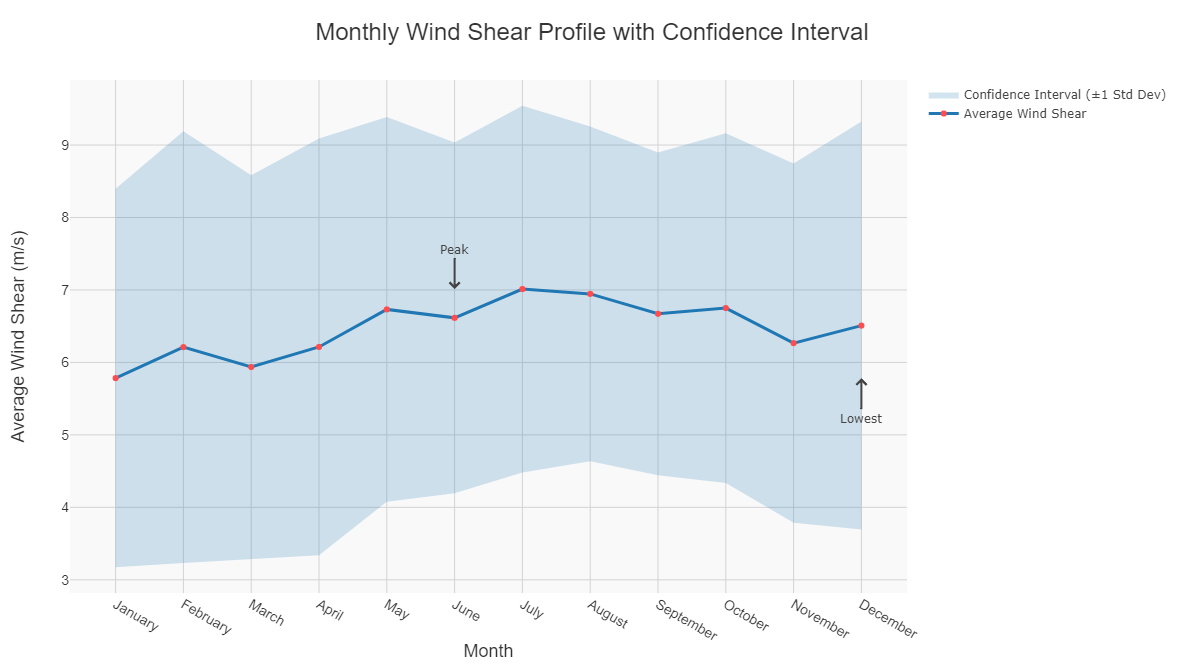
Monthly Wind Shear Profile with Confidence Interval
This plot illustrates monthly variations in wind shear, with a confidence interval (shaded region) representing ±1 standard deviation. Wind shear influences turbine efficiency and structural stress, making it a critical parameter in wind resource assessment.
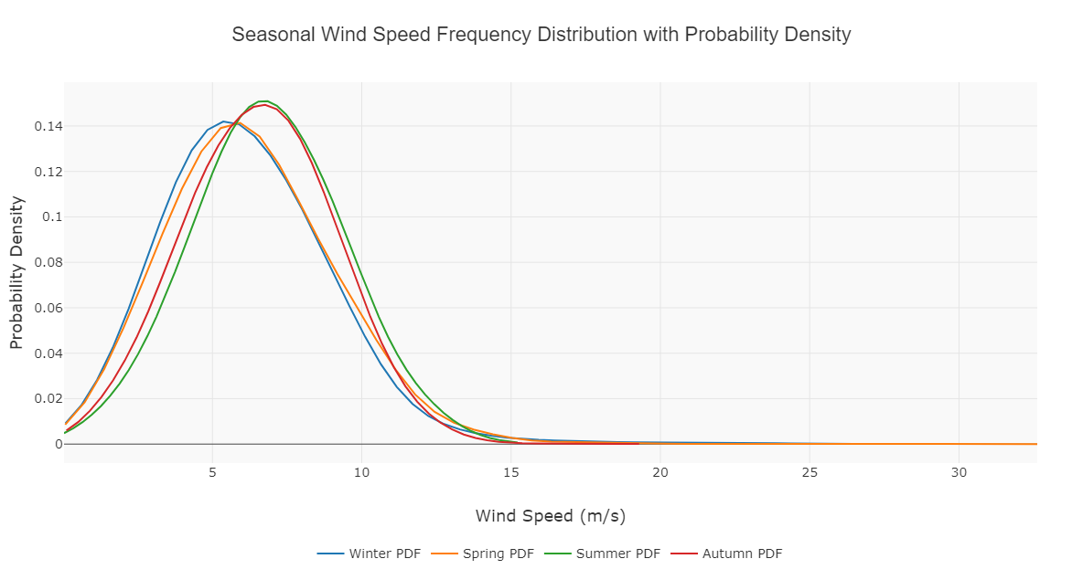
Seasonal Wind Speed Frequency Distribution with Probability Density
This plot presents seasonal wind speed distributions, showing probability density functions (PDFs) for Winter, Spring, Summer, and Autumn. These distributions provide insights into seasonal wind variations, essential for optimizing wind energy generation throughout the year.
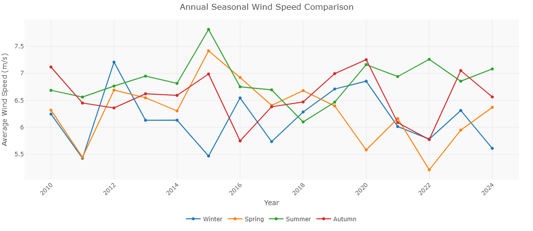
Annual Seasonal Wind Speed Comparison
This plot showcases seasonal wind speed trends over multiple years, tracking variations across Winter, Spring, Summer, and Autumn. Understanding seasonal fluctuations is critical for long-term wind energy forecasting, turbine efficiency, and grid integration strategies.
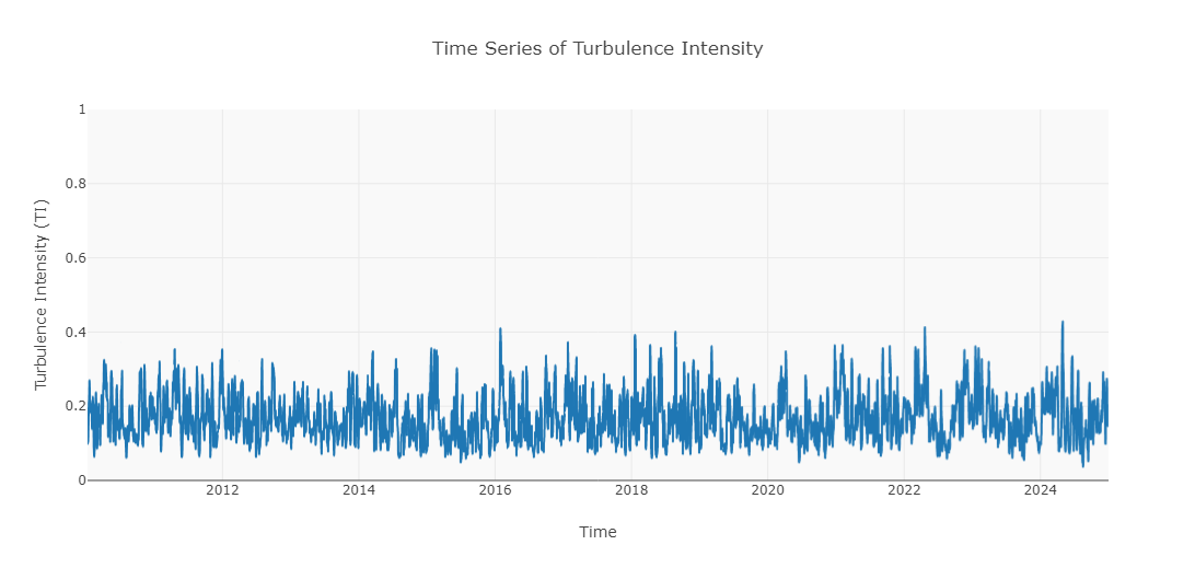
Turbulence Intensity Time Series
This plot represents the time evolution of turbulence intensity (TI) over multiple years, a key factor in wind turbine performance and structural reliability.
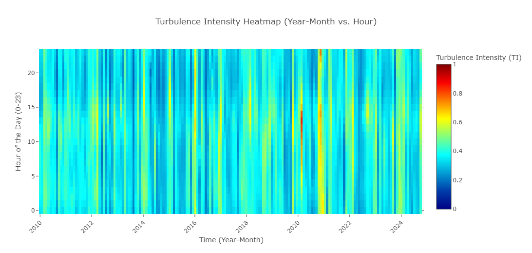
Turbulence Intensity Heatmap (Year-Month vs. Hour)
This high-resolution heatmap reveals the hourly turbulence intensity (TI) variations over time, capturing critical fluctuations across different months and years..
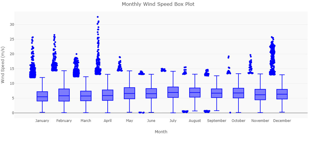
Monthly Wind Speed Variability (Box Plot)
This box plot visualization provides a detailed statistical summary of wind speed distributions for each month, showcasing
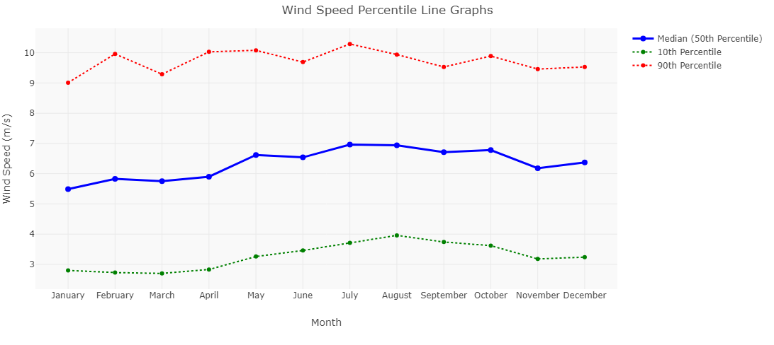
Wind Speed Percentile Analysis
This line graph visualization illustrates:
✅ 10th Percentile (Low Wind Conditions – Green Dashed Line)
✅ 50th Percentile (Median Wind Speed – Blue Solid Line)
✅ 90th Percentile (High Wind Conditions – Red Dashed Line).
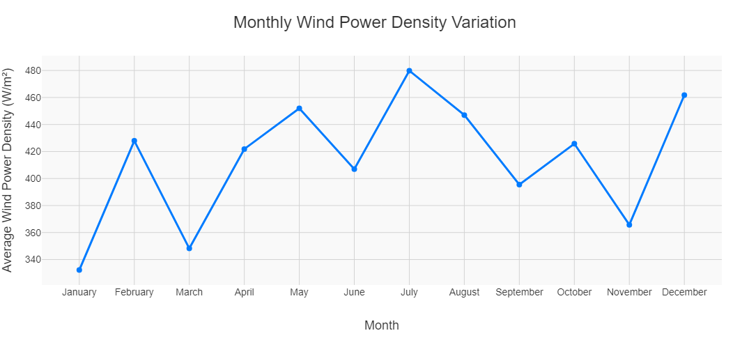
Monthly Wind Power Density Variation
Explore the fluctuations in wind power potential across the year with precision-engineered insights. Our advanced analytics empower you to harness peak energy efficiency, optimize turbine performance, and maximize renewable energy generation
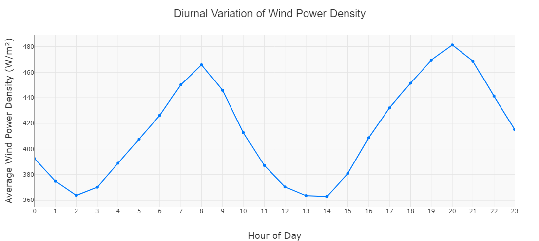
Diurnal Power Density Trends
Analyze how wind power density fluctuates throughout the day, unlocking key insights for energy optimization. WindAiza provides precise diurnal trends, enabling smarter turbine operation and peak energy capture.
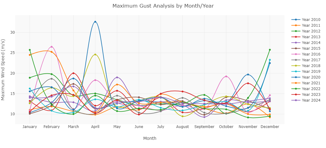
Maximum Gust Analysis: Tracking Extreme Wind Events Across the Years
This feature visualizes the highest wind gusts recorded each month across multiple years, offering crucial insights for wind farm resilience, turbine safety, and extreme weather planning
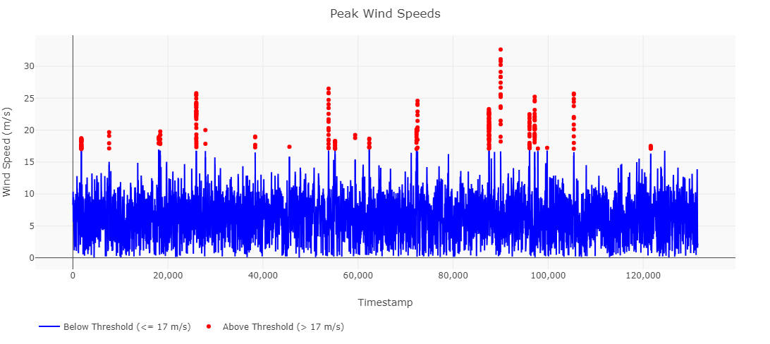
Peak Wind Speeds: Identifying Extreme Wind Events for Optimized Turbine Performance
Track and analyze peak gusts! This feature pinpoints wind speeds exceeding critical thresholds, helping optimize turbine safety, wind farm operations, and extreme weather preparedness.
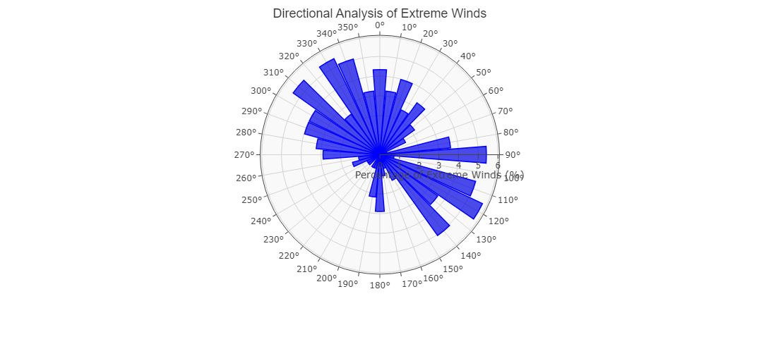
Extreme Wind Direction Analysis: Unlocking Critical Wind Flow Patterns
Where do the strongest winds originate? This advanced polar analysis identifies the dominant directions of extreme wind events, providing vital insights for turbine placement, structural resilience, and wind farm optimization.
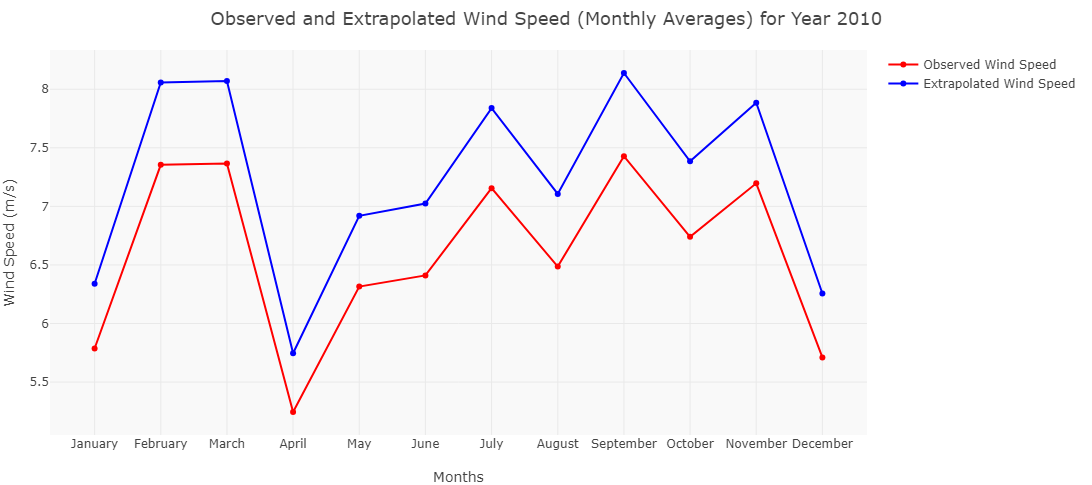
Wind Speed Extrapolation for Superior Energy Forecasting
By accurately adjusting wind speeds to turbine hub height, WindAiza ensures unparalleled accuracy in energy yield predictions, optimizing site assessment for maximum performance
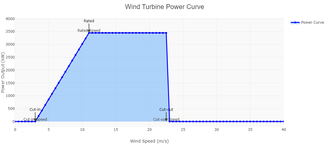
Wind Turbine Power Curve Analysis
Maximize energy efficiency with WindAiza’s Power Curve Analysis. This feature accurately models turbine performance, from cut-in speed to rated output and cut-out threshold, ensuring precise energy yield estimation.
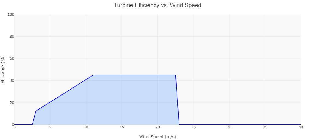
Turbine Efficiency Analysis
Our cutting-edge model provides a detailed efficiency profile across varying wind speeds, ensuring peak energy conversion and optimal power output
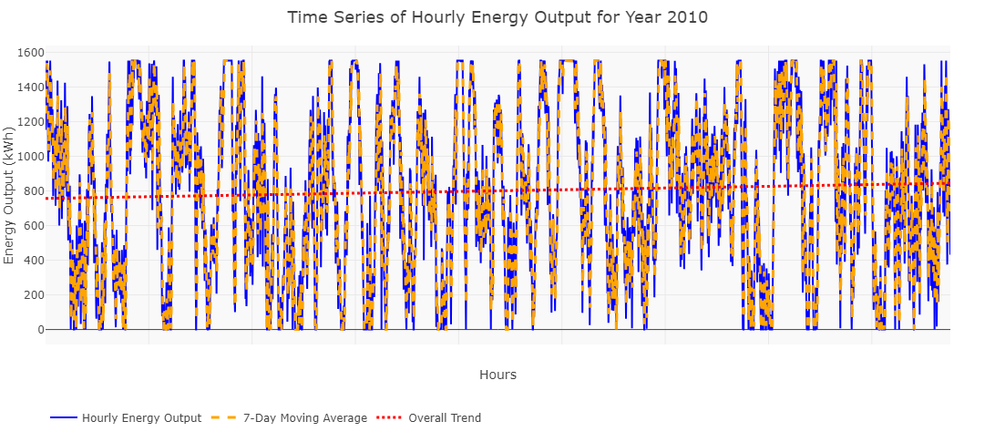
Real-Time Hourly Energy Output Analysis
Experience unparalleled precision with WindAiza’s Hourly Energy Output Tracking. Our advanced visualization captures real-time fluctuations, integrates 7-day moving averages, and identifies long-term trends in power generation. Optimize performance, predict energy yield, and enhance operational efficiency with industry-leading analytics..
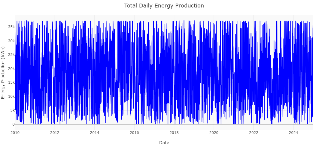
Total Daily Energy Production Monitoring
WindAiza’s Total Daily Energy Production Tracker delivers high-resolution insights into daily power generation trends over years. Experience unmatched clarity in energy variability, optimize renewable energy forecasting, and maximize efficiency with our world-class analytics.
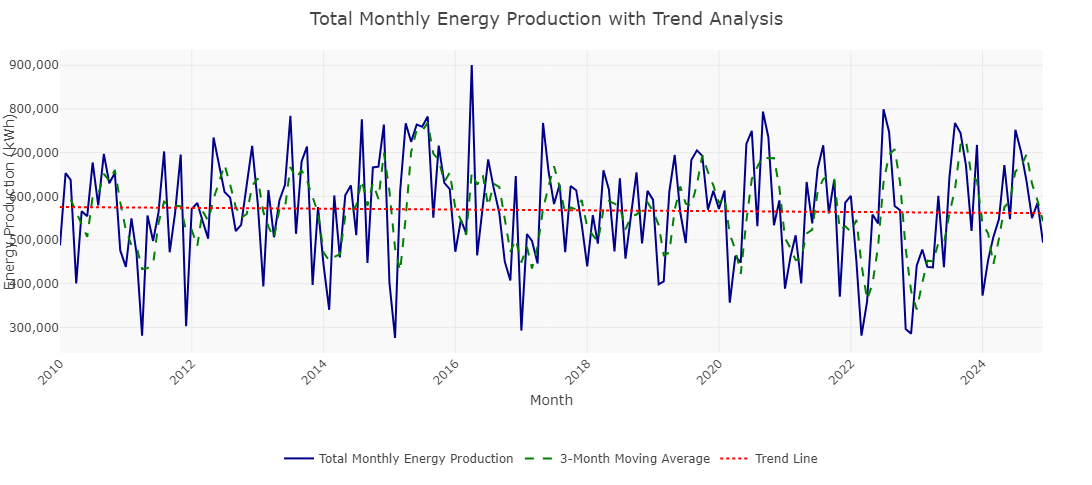
Total Monthly Energy Production with Trend Analysis
Unveil long-term energy trends with WindAiza’s Total Monthly Energy Production Tracker. Featuring moving averages and trend analysis, this world-class tool empowers you to optimize wind farm efficiency, forecast production variations, and strategically plan for future energy demands.
Total Annual Energy Production
Track your wind farm’s performance with precision! WindAiza’s Total Annual Energy Production feature provides insightful year-by-year energy output trends, enabling strategic decision-making, operational optimization, and long-term energy planning.

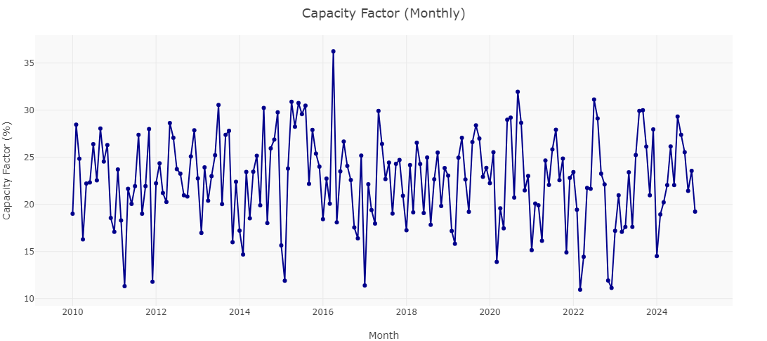
Capacity Factor (Monthly)
Unleash the full potential of your wind farm! WindAiza’s Capacity Factor Analysis provides a comprehensive monthly performance breakdown, helping you optimize energy output, enhance turbine efficiency, and maximize returns. Precision-driven insights for next-level wind energy management!
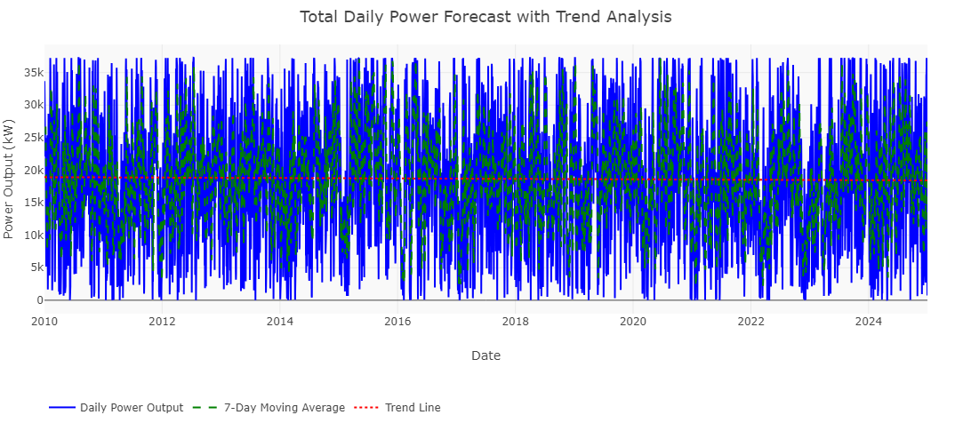
Total Daily Power Forecast with Trend Analysis
Empower your energy strategy with cutting-edge forecasting! WindAiza’s Total Daily Power Forecast delivers high-precision power output predictions, backed by 7-day moving averages and long-term trend analysis. Stay ahead with data-driven insights for smarter wind energy management.
Total Monthly Power Forecast
WindAiza’s Total Monthly Power Forecast provides accurate and reliable energy predictions, ensuring optimized grid integration and strategic decision-making
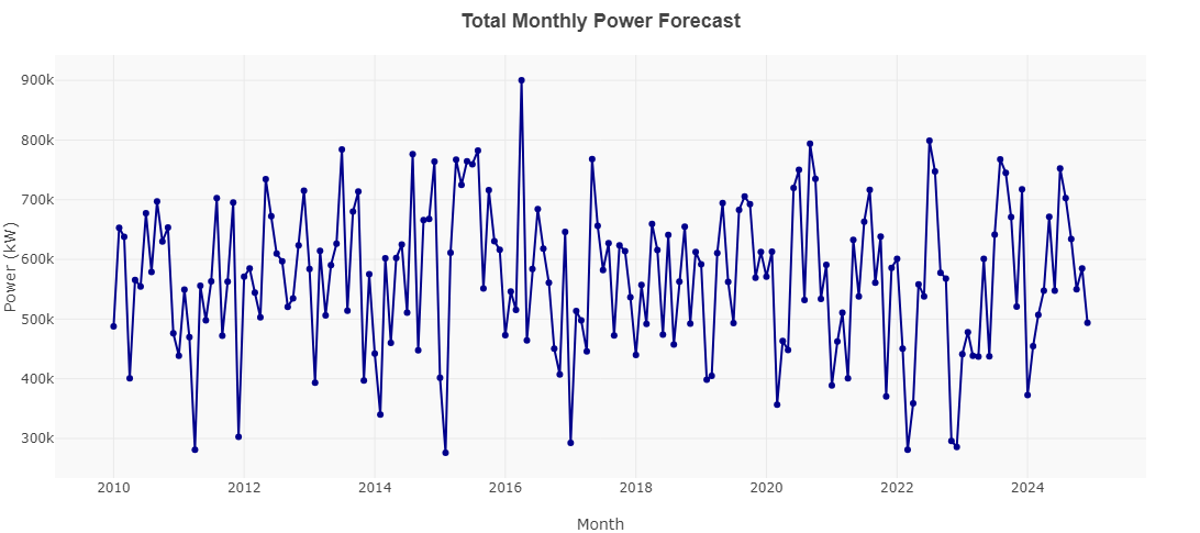
Total Monthly Power Forecast
WindAiza’s Total Monthly Power Forecast provides accurate and reliable energy predictions, ensuring optimized grid integration and strategic decision-making